
The Complete Guide to AI Image Prompts: 8 Dimensions to Optimize Your Results
Master the art of AI image prompting with our comprehensive 8-dimension framework. Learn how to write better prompts for text-to-image models through theory, real examples, and reusable templates.
Introduction
If you've ever typed "a cat" into an AI image generator and gotten a blurry mess, or spent an hour tweaking a prompt only to produce mediocre results, you've experienced the core challenge of AI art: prompt quality determines output quality.
The difference between a weak prompt and an optimized one isn't magic—it's structure. Professional AI artists and designers don't guess their way to great images. They follow systematic frameworks that control what the AI model sees, interprets, and renders.
This guide introduces an 8-dimension framework for writing better AI image prompts. Whether you're creating product photos, editorial illustrations, social media assets, or concept art, these dimensions give you practical levers to pull for predictable, high-quality results.
By the end of this article, you'll understand:
- The 8 core and supporting dimensions that shape AI image outputs
- Which dimensions matter most for your specific use case
- How to avoid common conflicts that produce chaotic results
- Reusable prompt templates you can adapt immediately
All examples in this guide were generated using GoAIGen with gpt-image-2, so you can reproduce and experiment with them yourself.
Core Dimension 1: Subject Content Layer
What it controls: What the AI draws—the main objects, people, scenes, or concepts in your image.
Why it matters: Without a clear subject, the model guesses. Vague prompts produce vague, inconsistent outputs.
Weak vs. Strong Subject Descriptions
Compare these two prompts:
❌ Weak: "a portrait"
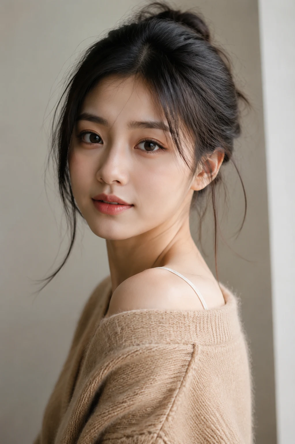
The model has no constraints—it might generate any age, gender, style, or mood. You get randomness, not control.
✅ Strong: "a portrait of a young woman in her 20s, wearing a black turtleneck, short pixie haircut, confident expression, looking directly at camera, soft studio lighting, neutral gray background, professional photography"
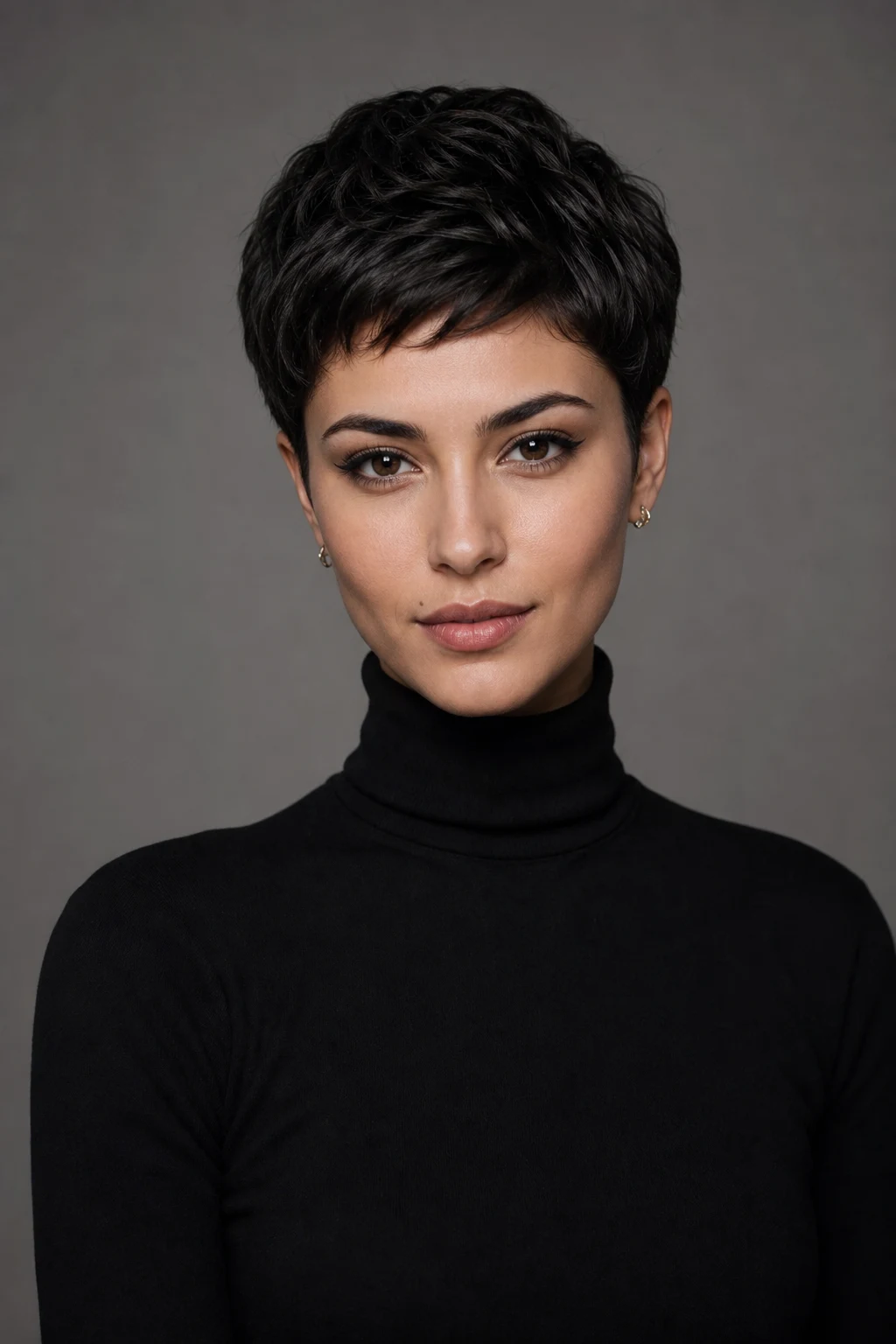
Now you have specificity: age range, clothing, hairstyle, expression, gaze direction, lighting, and background. The model has clear instructions, producing consistent, intentional results.
The 4 Levels of Subject Clarity
1. Vague ("a car") → unpredictable results 2. Basic ("a red sports car") → some control 3. Specific ("a red Ferrari 488 GTB, glossy paint, parked on coastal road") → strong control 4. Detailed (+ pose, surroundings, interactions, state) → maximum control
Rule of thumb: If you'd struggle to sketch it from your description alone, the AI will struggle too.
Describing Actions and Relationships
For dynamic scenes, verbs matter:
- "a person running" vs. "a sprinter mid-stride, explosive forward motion"
- "two people talking" vs. "two colleagues facing each other across a cafe table, one gesturing animatedly"
For multiple subjects, specify their spatial relationship:
- "a dog and a cat" → ambiguous
- "a golden retriever sitting beside a gray tabby cat, both facing the viewer" → clear
Core Dimension 2: Artistic Style Layer
What it controls: How the image looks—the aesthetic treatment, medium, and visual language.
Why it matters: Style transforms the same subject from photorealistic to cartoon, from editorial to surreal. Without style direction, models default to a generic "AI art" look.
No Style vs. Styled Prompts
Let's test a simple subject across three style treatments:
Subject: "a coffee shop interior"
❌ No style specified:
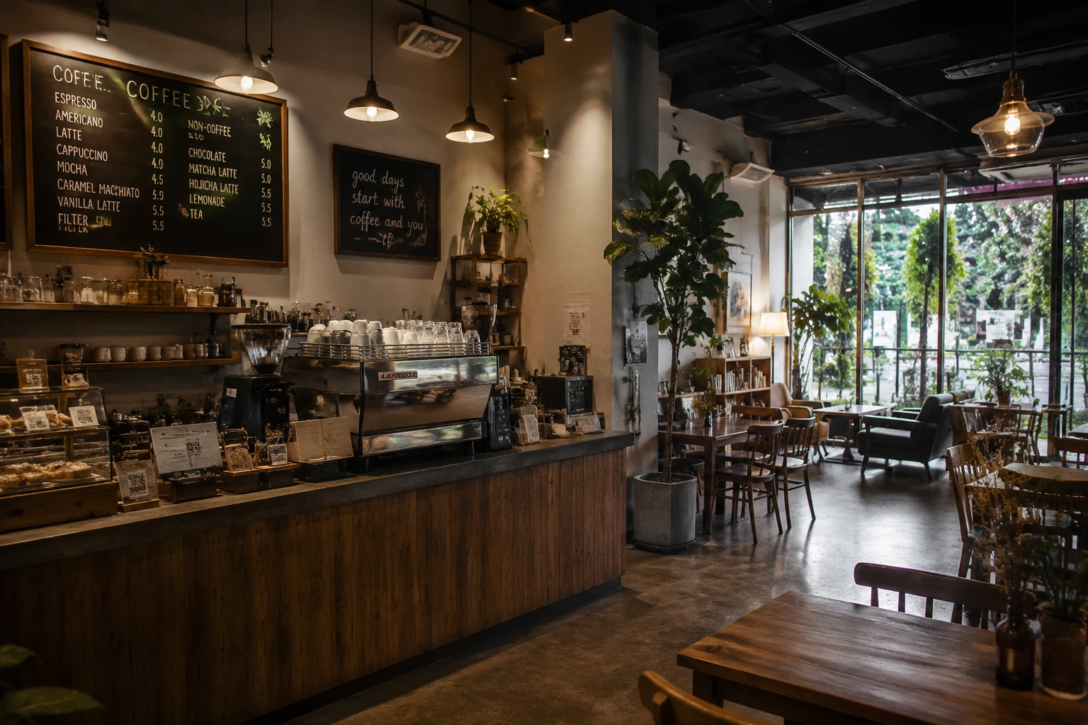
The model produces a generic, safe result—neither compelling nor memorable.
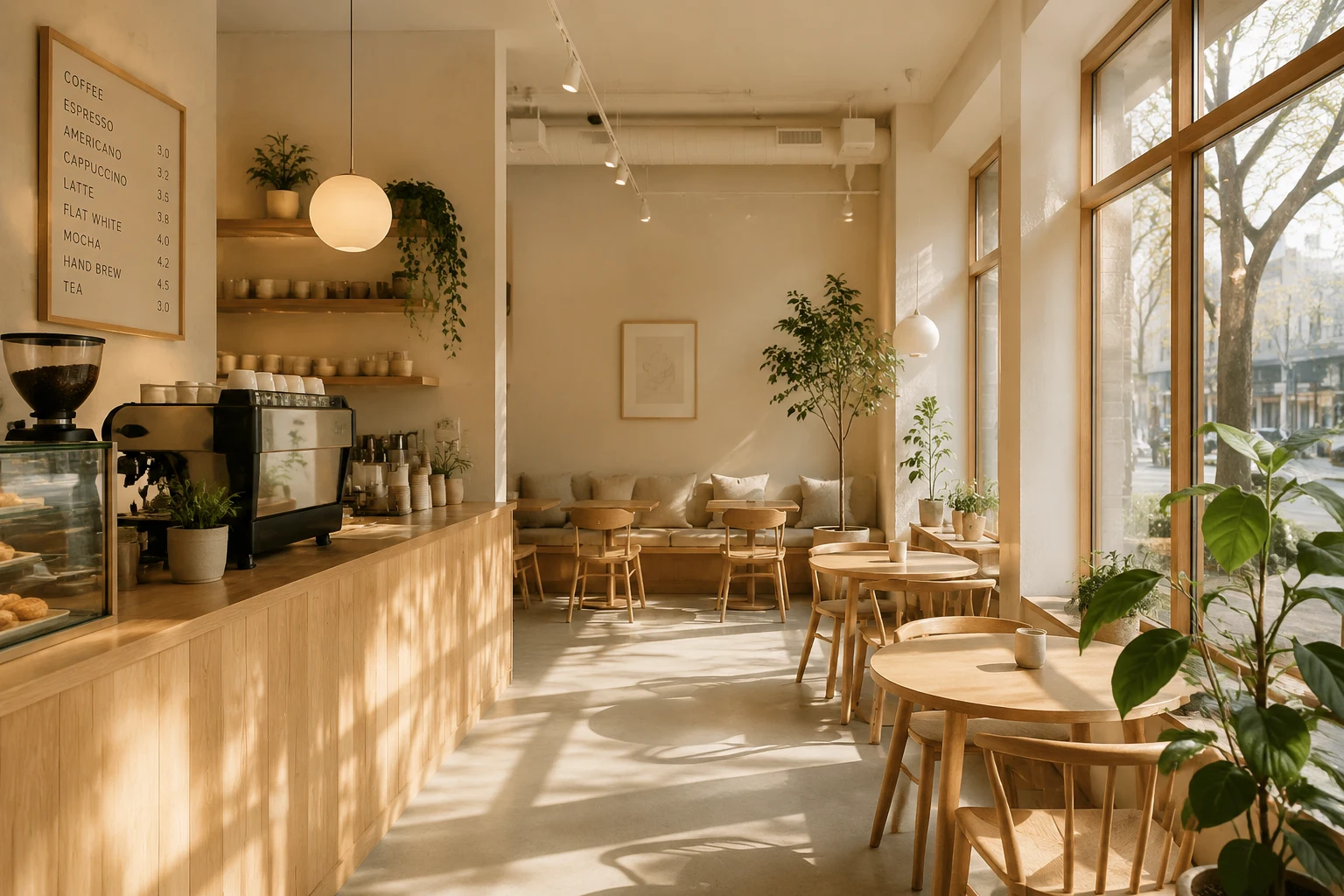
✅ Scandinavian style:
"a coffee shop interior, minimalist Scandinavian design, natural wood furniture, soft natural light streaming through large windows, clean lines, hygge atmosphere, potted plants, warm beige tones"
✅ Cyberpunk style:
"a coffee shop interior, cyberpunk aesthetic, neon signs in blue and pink, dark moody lighting, futuristic holograms, industrial metal surfaces, exposed cables, rain-streaked windows, dystopian atmosphere"
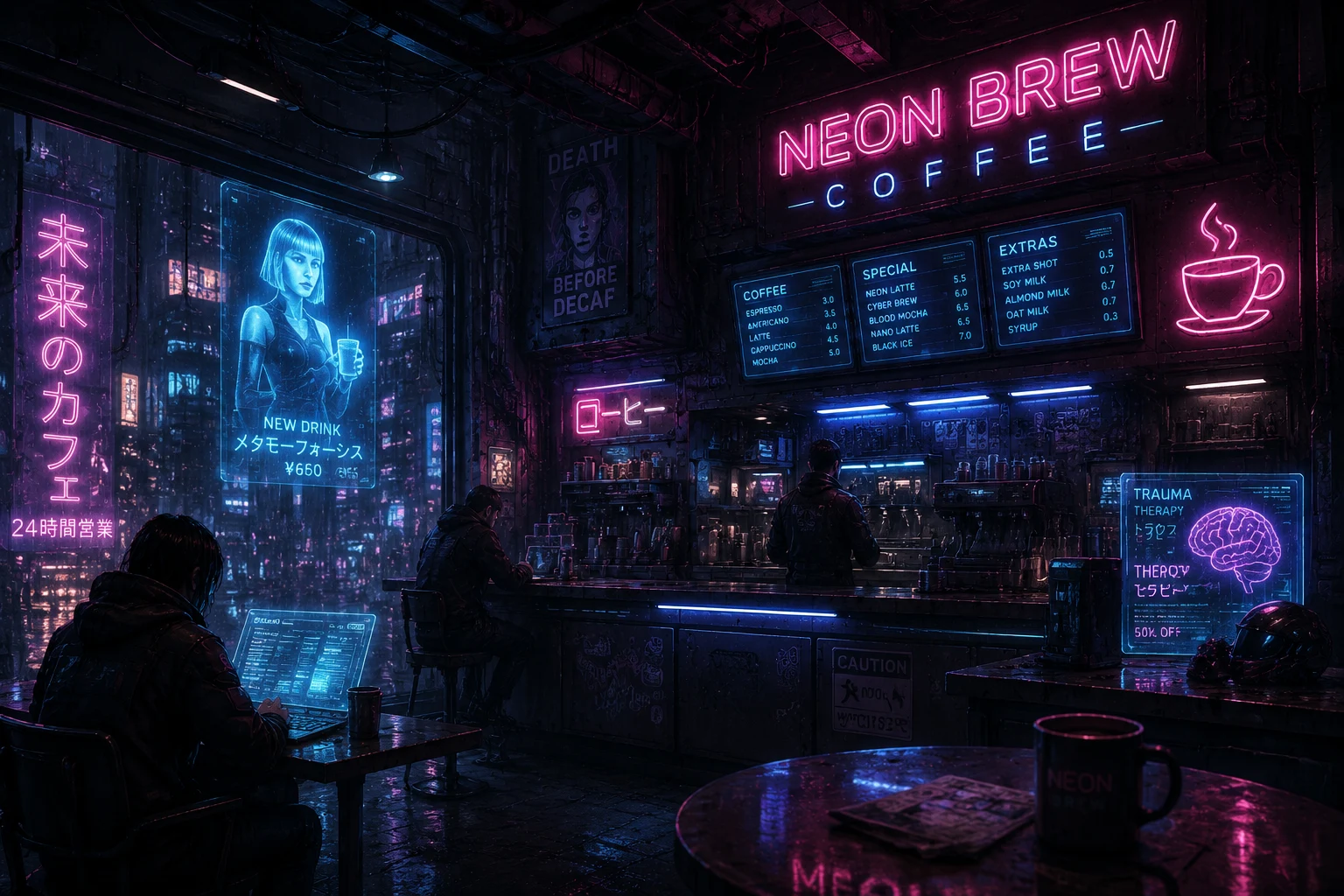
Same subject, radically different outcomes—controlled entirely by style vocabulary.
Common Style Vocabularies
Medium-based:
- Photography (studio, editorial, street, documentary, film)
- Digital art (concept art, matte painting, 3D render)
- Traditional art (oil painting, watercolor, pen-and-ink, collage)
- Graphic design (poster art, logo, infographic, flat design)
Aesthetic-based:
- Realism (photorealistic, hyperrealistic, cinematic)
- Stylization (anime, cartoon, comic book, pixel art)
- Historical (Art Nouveau, Bauhaus, Art Deco, Renaissance)
- Genre (cyberpunk, steampunk, solarpunk, noir)
Processing-based:
- High contrast vs. soft pastel
- Minimalist vs. maximalist
- Sharp vector vs. painterly
- Matte vs. glossy
Avoid Style Conflicts
Don't mix incompatible styles in one prompt:
- ❌ "photorealistic flat illustration"
- ❌ "minimalist maximalist design"
- ❌ "vintage futuristic aesthetic"
Pick one coherent direction. If you want to blend styles intentionally, phrase it as a hybrid:
- ✅ "a blend of Art Nouveau curves with cyberpunk neon accents"
Strong Dimension 3: Composition & Camera Layer
What it controls: Spatial arrangement, perspective, framing, and visual hierarchy.
Why it matters: Composition determines how the viewer's eye moves through the image. The same subject photographed from different angles tells completely different stories.
Camera Angles Transform Meaning
Let's take a simple subject—"a mountain landscape"—and see how camera direction changes the emotional impact:
Basic (no camera info):
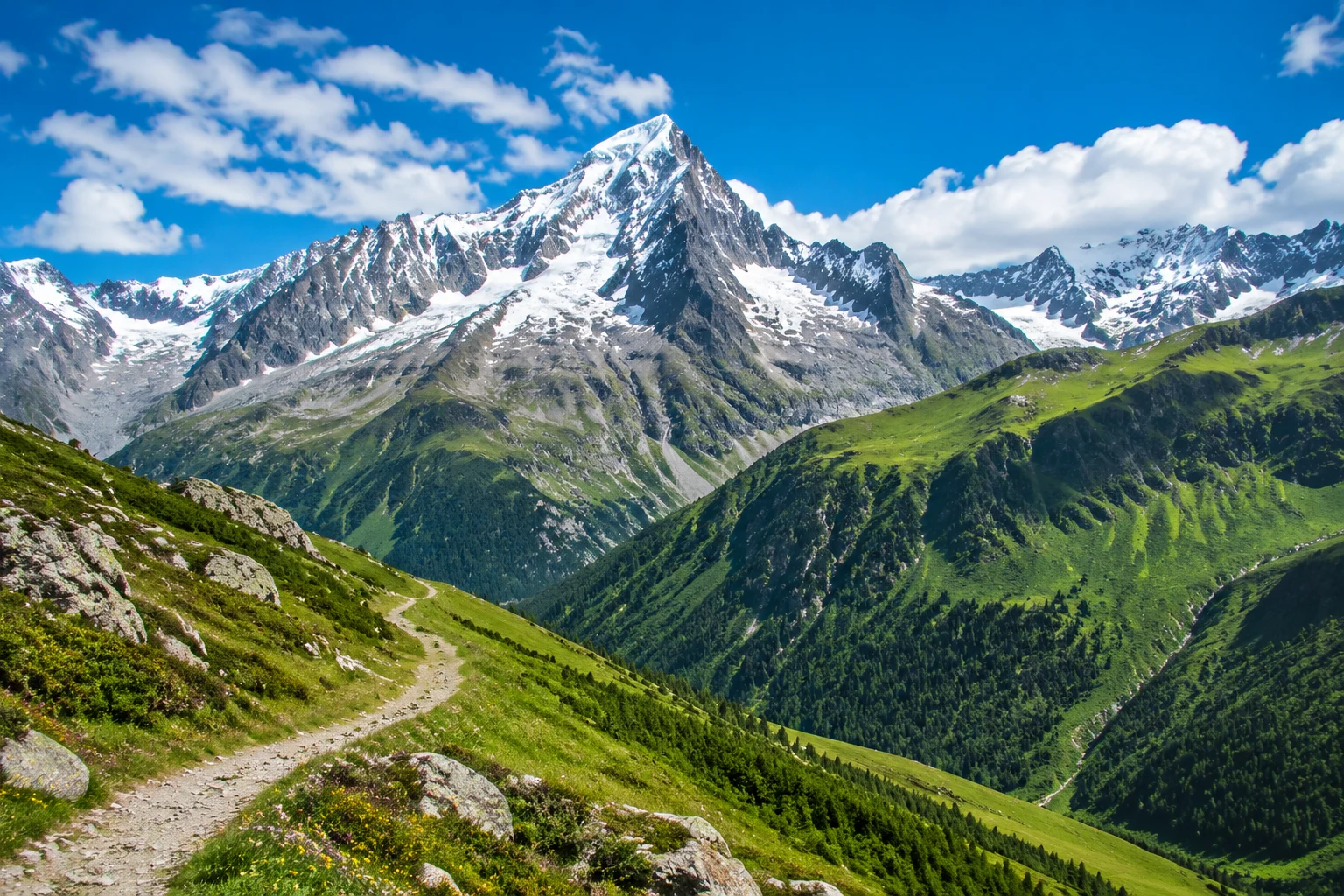
Generic, flat—the model picks a safe middle-ground.
Wide-angle, low-angle:
"a mountain landscape, wide-angle shot, low angle looking up at peaks, dramatic perspective, rule of thirds composition, foreground rocks for depth, leading lines toward summit, epic scale"
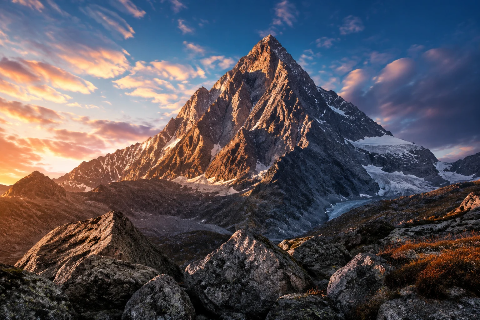
Now the mountains feel towering, majestic—the low angle amplifies their grandeur.
Telephoto compression:
"a mountain landscape, telephoto lens compression, layered mountain ridges, compressed depth, centered symmetrical composition, minimalist zen aesthetic, soft focus background"
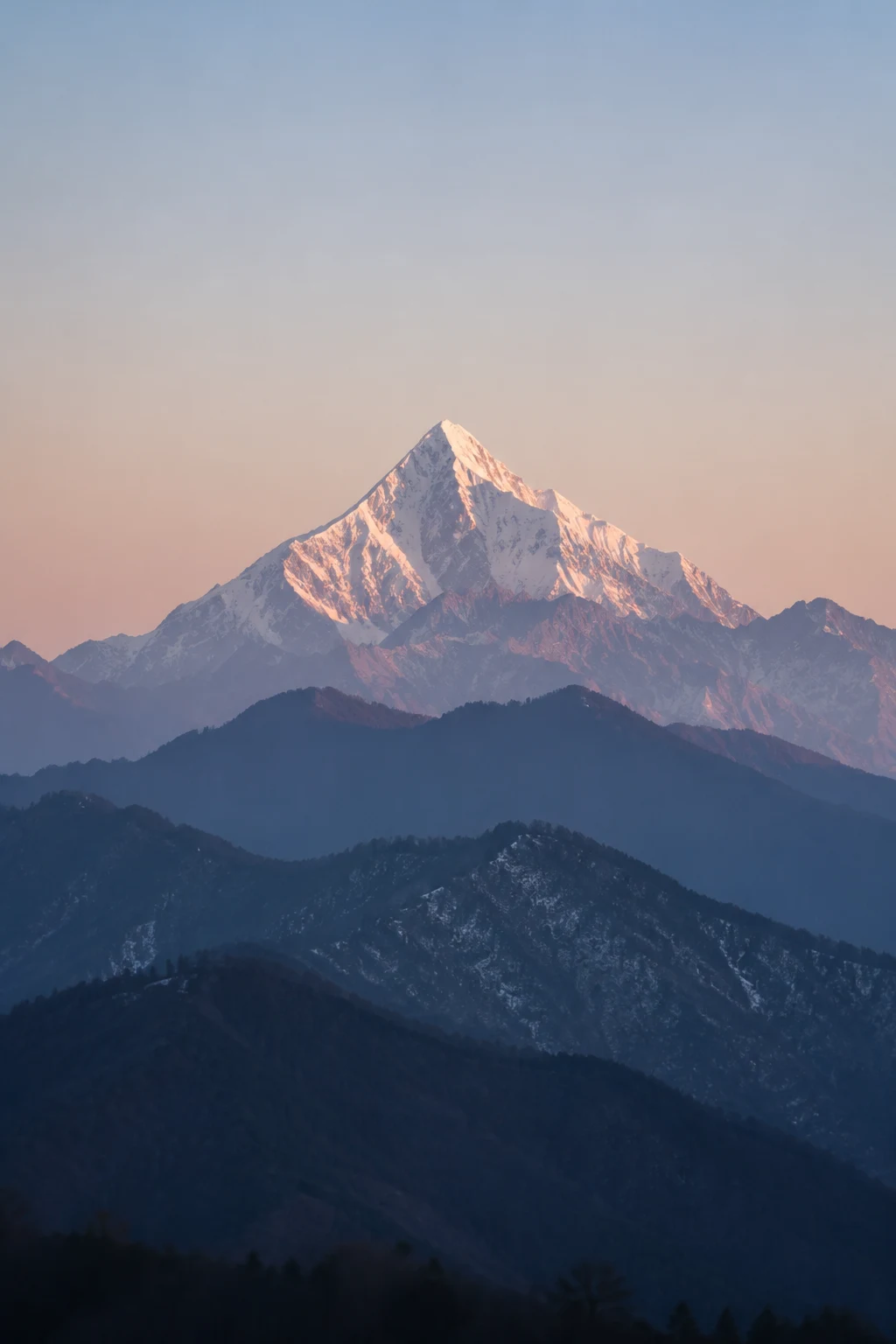
The stacked layers create calm, meditative depth—a completely different mood.
Aerial bird's-eye view:
"a mountain landscape, aerial bird's-eye view, drone photography, diagonal composition, mountain range pattern, abstract topographic lines, vast negative space"
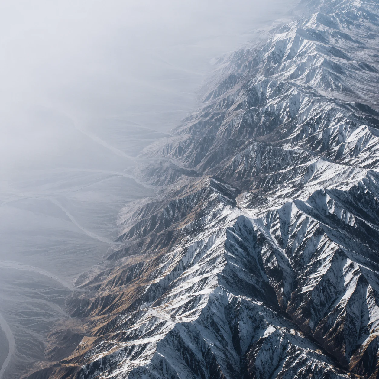
From above, the mountains become geometric patterns—abstract and minimalist.
Quick Reference: Lens Language
| Lens Type | Effect | Best For | |-----------|--------|----------| | Wide-angle (14-35mm) | Distorted, immersive, exaggerated depth | Architecture, landscapes, dramatic scenes | | Standard (35-70mm) | Natural, human-eye perspective | Portraits, street photography, general use | | Telephoto (70-200mm+) | Compressed depth, isolated subject | Portraits, wildlife, layered compositions | | Macro | Extreme close-up, fine detail | Product shots, texture, small objects | | Fish-eye | Spherical distortion, 180° view | Creative effects, skate/action sports |
Composition Rules (and When to Break Them)
Rule of Thirds: Place key elements along the 1/3 grid lines, not dead center.
- ✅ Use for: Natural scenes, portraits, balanced layouts
- ❌ Skip for: Symmetrical subjects, minimalist centered designs
Leading Lines: Use paths, roads, rivers, or architectural elements to guide the eye.
- ✅ Prompt: "diagonal leading line from bottom-left to top-right"
- ✅ Prompt: "staircase creating strong vertical leading lines"
Negative Space: Empty areas that give the subject room to breathe (and room for text overlays).
- ✅ Prompt: "left third empty for text placement, subject on right"
- ✅ Prompt: "surrounded by vast negative space, minimalist isolation"
Frame Within a Frame: Use doorways, windows, or natural elements to create nested focus.
- ✅ Prompt: "viewed through an archway, framing the subject naturally"
Strong Dimension 4: Lighting & Color Layer
What it controls: Mood, depth, emotional tone, and visual energy.
Why it matters: Lighting is the difference between "flat catalog photo" and "cinematic masterpiece." Color choices trigger psychological responses—warm tones feel inviting, cool tones feel clinical or serene.
The 2×2 Lighting Grid
Let's test the same subject—a white sneaker—across four lighting setups:
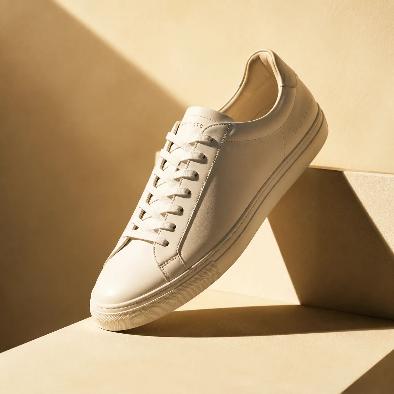
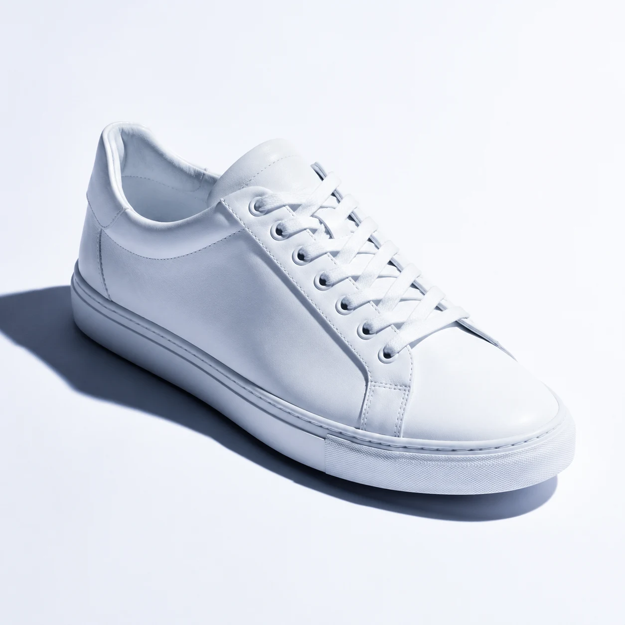
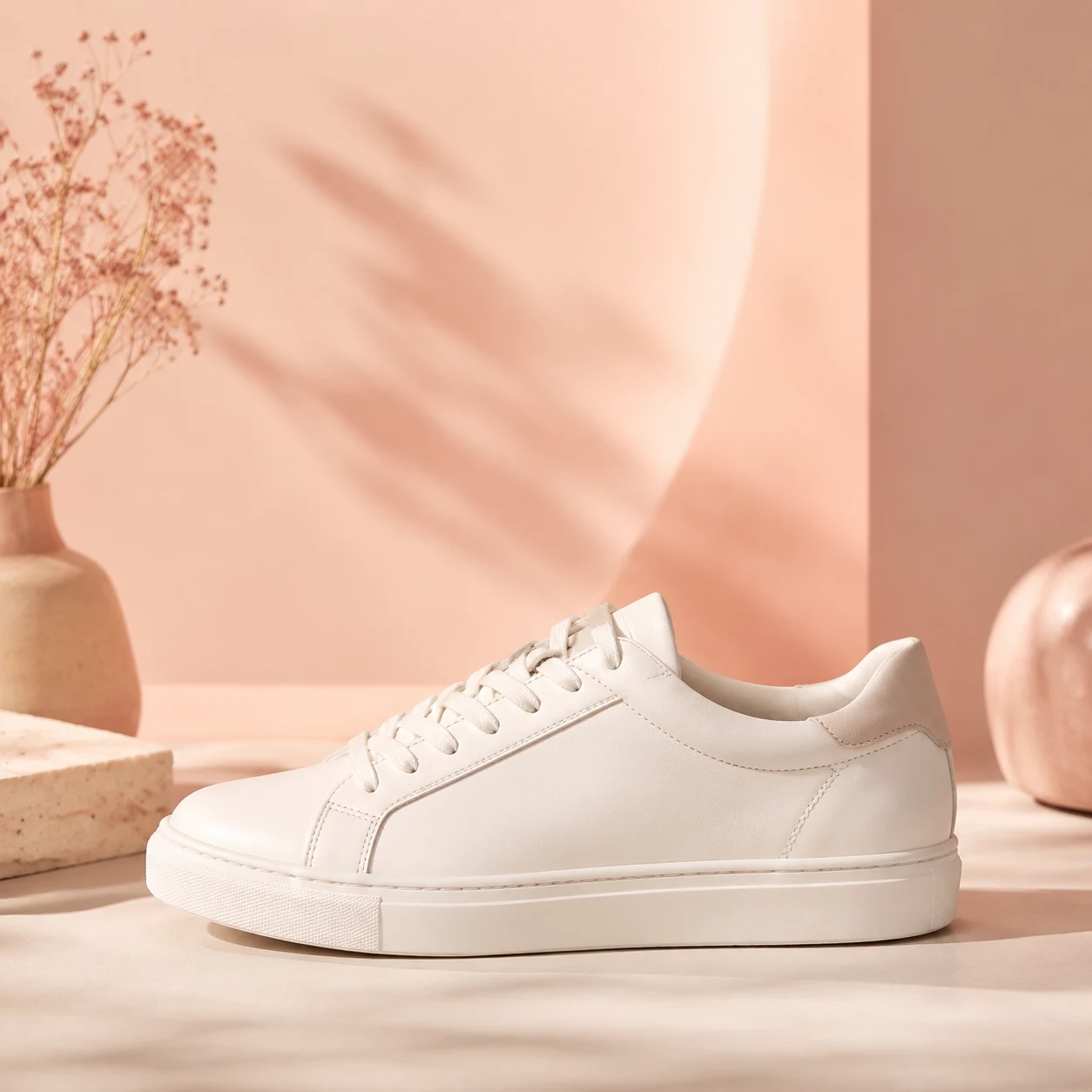
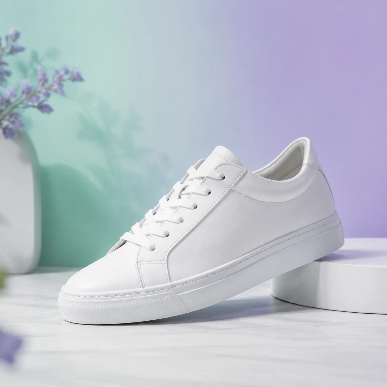
Hard light + warm tone = dramatic, commercial, bold Hard light + cool tone = editorial, clinical, modern Soft light + warm tone = lifestyle, approachable, cozy Soft light + cool tone = serene, minimal, spa-like
Same product, four completely different brand personalities—controlled entirely by lighting vocabulary.
Lighting Vocabulary Quick Guide
Light Quality:
- Hard/direct → sharp shadows, high contrast, dramatic
- Soft/diffused → gentle shadows, even illumination, approachable
- Rim/backlight → silhouette edges, separation from background
- Overhead/top-down → flat, editorial, Instagram-friendly
Light Direction:
- Front light → even, reduces texture, catalog-style
- Side light → reveals texture and dimension
- Backlight → creates silhouettes, halo effects
- Three-point (key + fill + rim) → professional studio look
Color Temperature:
- Golden hour (warm) → nostalgic, inviting, sunset glow
- Blue hour (cool) → calm, twilight, professional
- Neon (saturated) → cyberpunk, urban night, energetic
- Neutral/white → clean, modern, tech product
Color Scheme Strategies
Monochromatic: Single hue with value variations
- ✅ Prompt: "monochrome blue palette, ranging from navy to sky blue"
Complementary: Opposite colors on the color wheel (e.g., blue + orange)
- ✅ Prompt: "teal and orange color grading, cinematic complementary scheme"
Analogous: Adjacent colors (e.g., blue, teal, green)
- ✅ Prompt: "harmonious analogous palette: sage green, mint, seafoam"
Accent Color: Mostly neutral with one bold pop
- ✅ Prompt: "predominantly grayscale with vibrant red accent"
Supporting Dimensions 5-7: Atmosphere, Technical Quality, Medium
These dimensions fine-tune mood and output fidelity but have less dramatic impact than the core four.
Dimension 5: Atmosphere & Mood
Emotional keywords guide the AI's tonal choices:
Prompt: "a person walking through a misty forest"
❌ Before adding atmosphere:
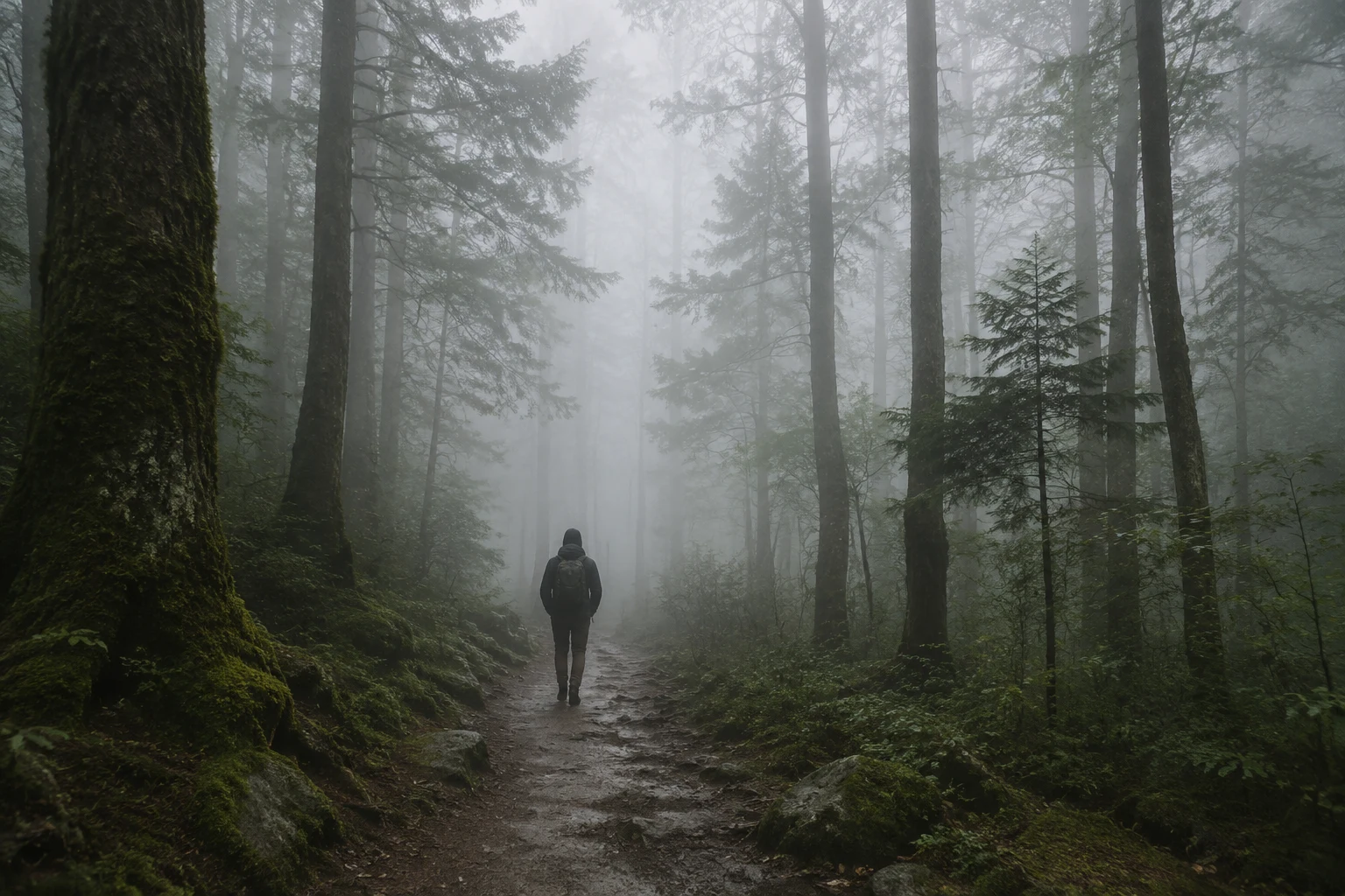
✅ After: "cinematic atmosphere"
"a person walking through a misty forest, cinematic atmosphere, volumetric god rays, moody color grading with teal and orange tones, shallow depth of field, film grain texture, widescreen composition, dramatic backlighting"
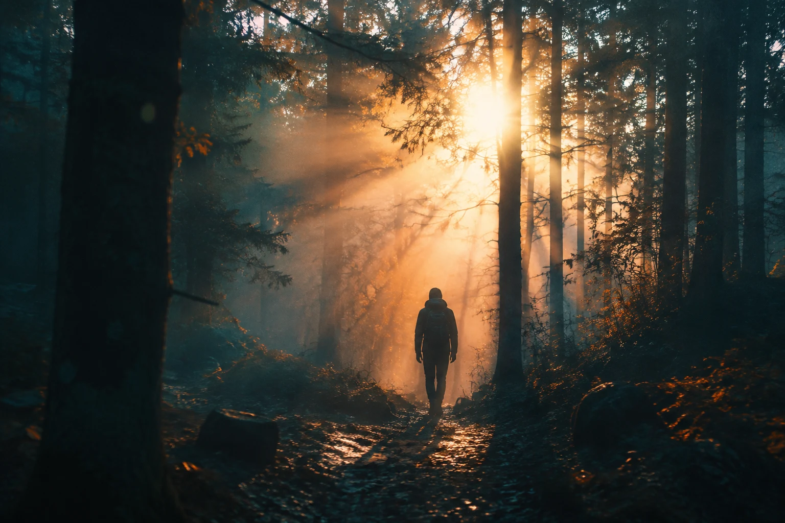
The word "cinematic" triggered film-grade lighting, color grading, and depth—transforming a simple scene into a movie still.
Mood Keyword Library (30+ options):
- Emotional: serene, tense, joyful, melancholic, mysterious, whimsical, dramatic
- Energy: calm, explosive, dynamic, still, chaotic, peaceful
- Atmosphere: moody, bright, ethereal, gritty, dreamy, harsh, soft
Dimension 6: Technical Quality
Keywords like "8K," "ultra detailed," "sharp," and "professional" have limited effect on most modern models. They act as gentle nudges rather than hard commands.
When to use them:
- As tie-breakers when the model hesitates between polished and rough
- In combination with other strong dimensions (never alone)
When to skip them:
- Don't stack ("ultra hyper mega detailed 8K 16K photorealistic") — it dilutes other terms
- Gemini and GPT-image models already default to high quality
Dimension 7: Medium & Output Context
Specifying the intended use helps the model understand composition and detail level:
- "for Instagram" → square/vertical, bold colors, high contrast
- "editorial magazine spread" → sophisticated, lots of negative space
- "concept art for game development" → detailed, multiple angles implied
- "product photography for ecommerce" → clean, centered, white background
Dimension 8: Conflict Detection & Priority
The Problem: Conflicting instructions confuse the model, producing chaotic results.
❌ Conflict example: "photorealistic flat vector illustration of a cat, ultra detailed cartoon"
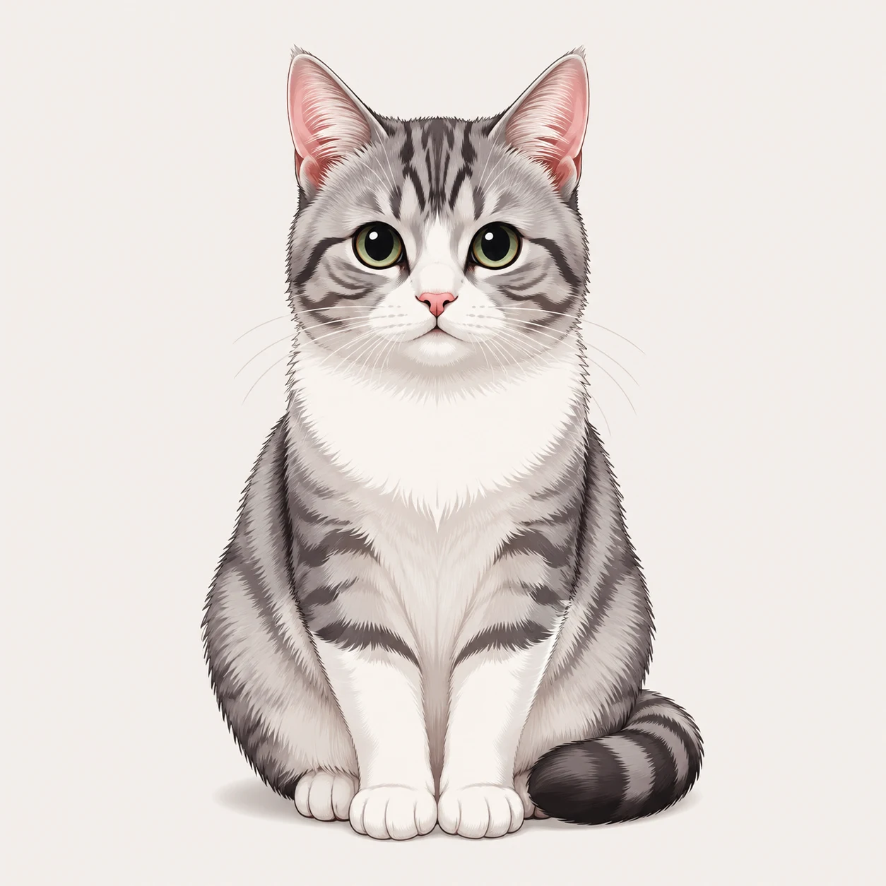
The model tries to satisfy "photorealistic" and "flat vector" simultaneously, resulting in a muddled middle ground that's neither.
Common Conflict Patterns
| Conflict Type | Example | Fix | |---------------|---------|-----| | Style clash | "minimalist maximalist design" | Pick one direction | | Light contradiction | "soft diffused harsh shadows" | Choose light quality | | Color mismatch | "monochrome vibrant rainbow" | Commit to one palette | | Perspective fight | "close-up wide establishing shot" | Define one framing | | Era blend | "vintage futuristic retro modern" | Specify single time period |
Dimension Priority Formula
When in doubt, this hierarchy prevents conflicts:
Subject (30%) > Style (25%) > Lighting (20%) > Composition (15%) > Mood (10%)
If your prompt gets too long (200+ words), trim from the bottom up—cut mood keywords before touching subject details.
Real-World Case Study: Building a Fitness Poster from Scratch
Let's apply the framework to a practical task: "Create a motivational poster for a fitness app."
Iteration 1: Basic subject
Prompt: "a person running up stairs"
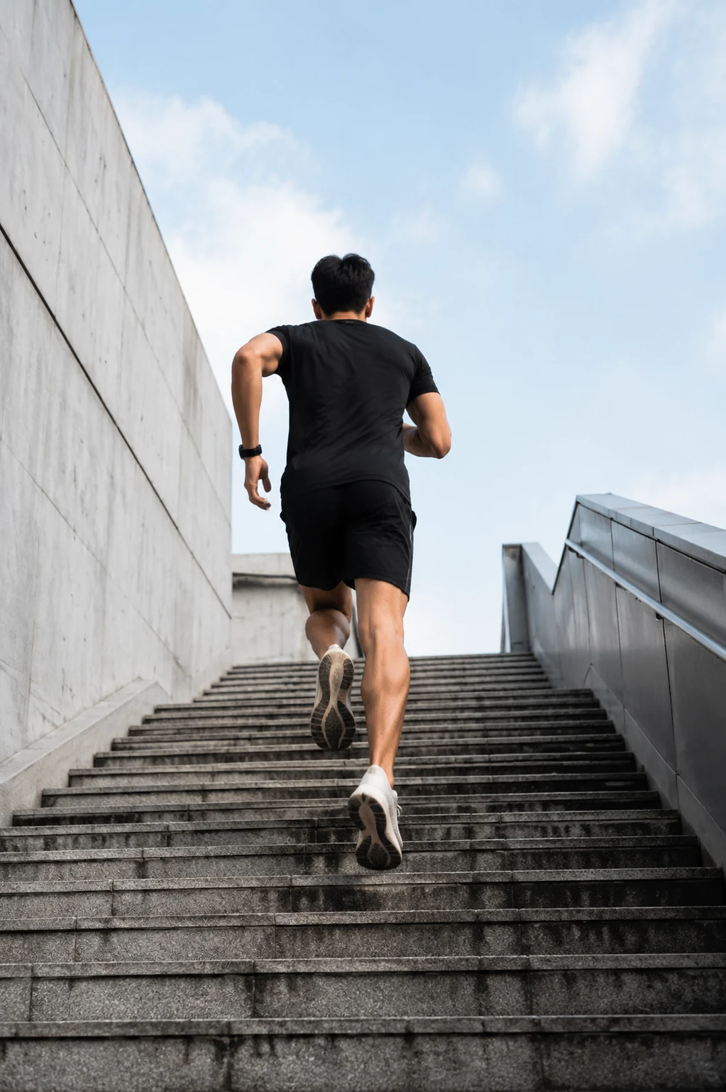
Generic stock photo vibe—not motivational.
Iteration 2: Add style layer
Prompt: "a person running up stairs, high-contrast graphic poster art, bold silhouette, motivational energy"
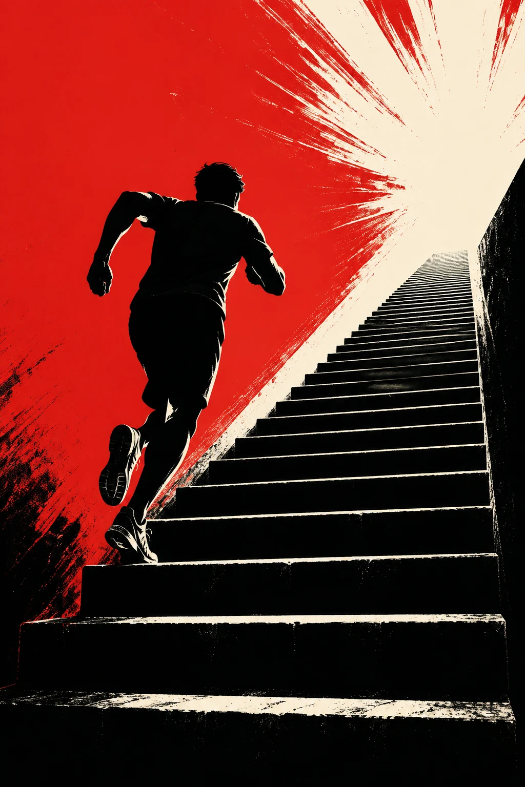
Better—the graphic treatment adds punch, but composition is weak.
Iteration 3: Add composition layer
Prompt: "a person running up stairs, high-contrast graphic poster art, bold silhouette, low-angle upward perspective, vertical composition with negative space on left for text, minimalist concrete aesthetic"
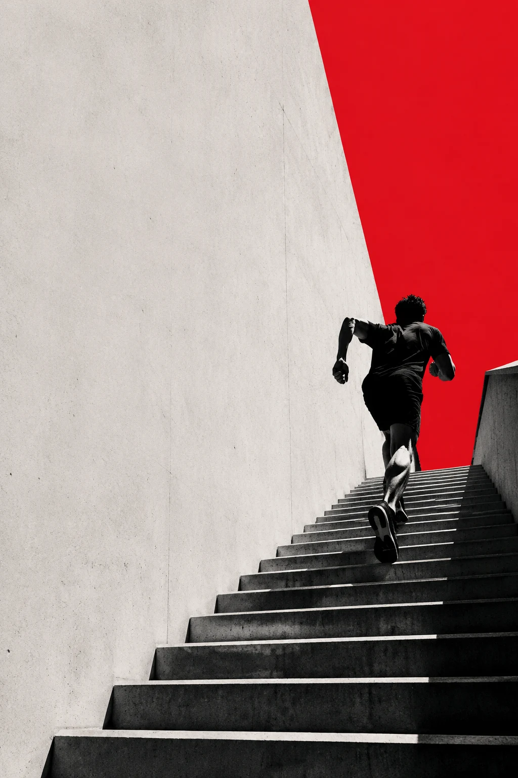
Now we have visual hierarchy and room for typography—closer to a real poster.
Iteration 4: Finalize with lighting & details
Prompt: "a dynamic athlete in compression gear sprints upward on minimalist concrete stairs, captured from low-angle rear perspective, vibrant red stripe cutting vertically through center as visual guideline, extreme high-key lighting with pure white background, sharp high-contrast silhouettes, bold typography space on left, graphic commercial poster aesthetic"
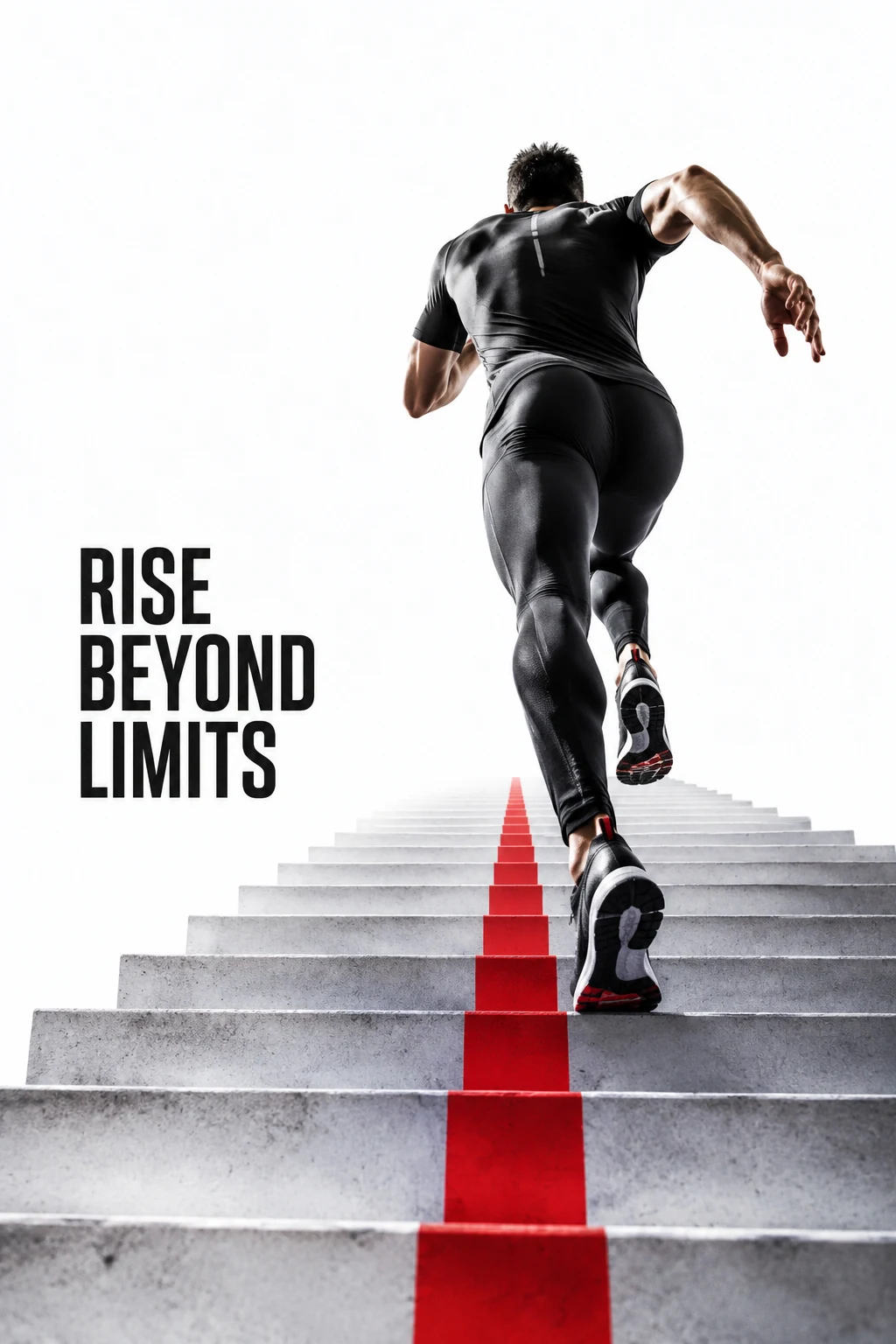
Final result: a publication-ready motivational poster with clear visual direction, purposeful negative space, and strong emotional impact.
What changed: We layered dimensions methodically—subject first, then style, then composition, then lighting—rather than trying to nail everything in one shot.
Reusable Prompt Templates
Copy these structures and fill in the brackets with your specifics:
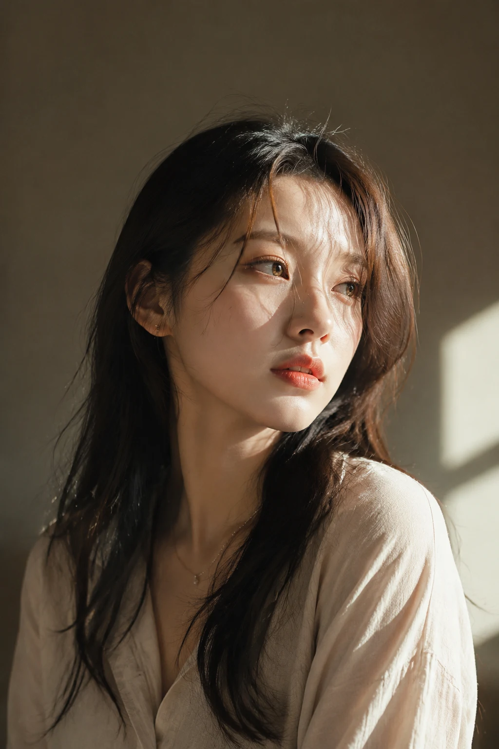
Template 1: Portrait Photography
a [subject] portrait, [age/gender] with [distinctive feature], [clothing style], [expression], [eye direction], [lighting type] lighting, [background], [photography style]Example: "a portrait of a woman in her 30s with silver hair, wearing minimal black clothing, serene expression, gazing slightly off-camera, soft window lighting, neutral gray backdrop, editorial fashion photography"
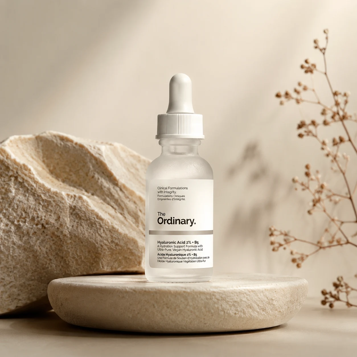
Template 2: Product Photography
a product shot of [product], [angle/perspective], [lighting setup], [background color/style], [mood], [photography style], high quality commercial photographyExample: "a product shot of a minimalist watch, three-quarter angle, soft diffused studio light, pastel gradient background, elegant and refined, luxury commercial photography"
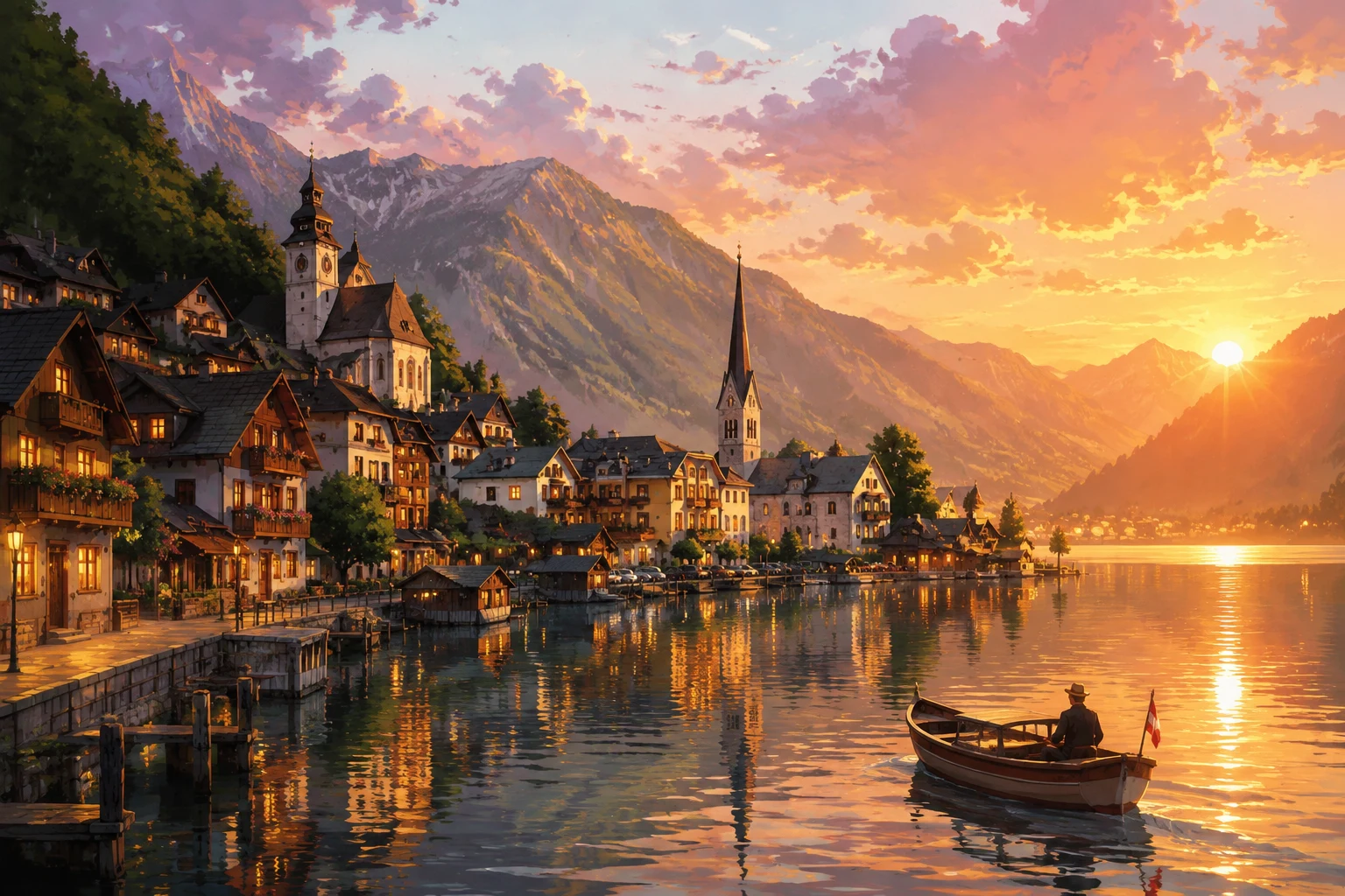
Template 3: Scene Illustration
a [location/scene], [art style], [time of day], [weather/atmosphere], [color palette], [composition notes], [mood], detailed illustrationExample: "a cozy bookshop interior, watercolor illustration, golden afternoon light, slight dust motes in air, warm earth tones with teal accents, asymmetrical composition, peaceful and inviting, detailed illustration"
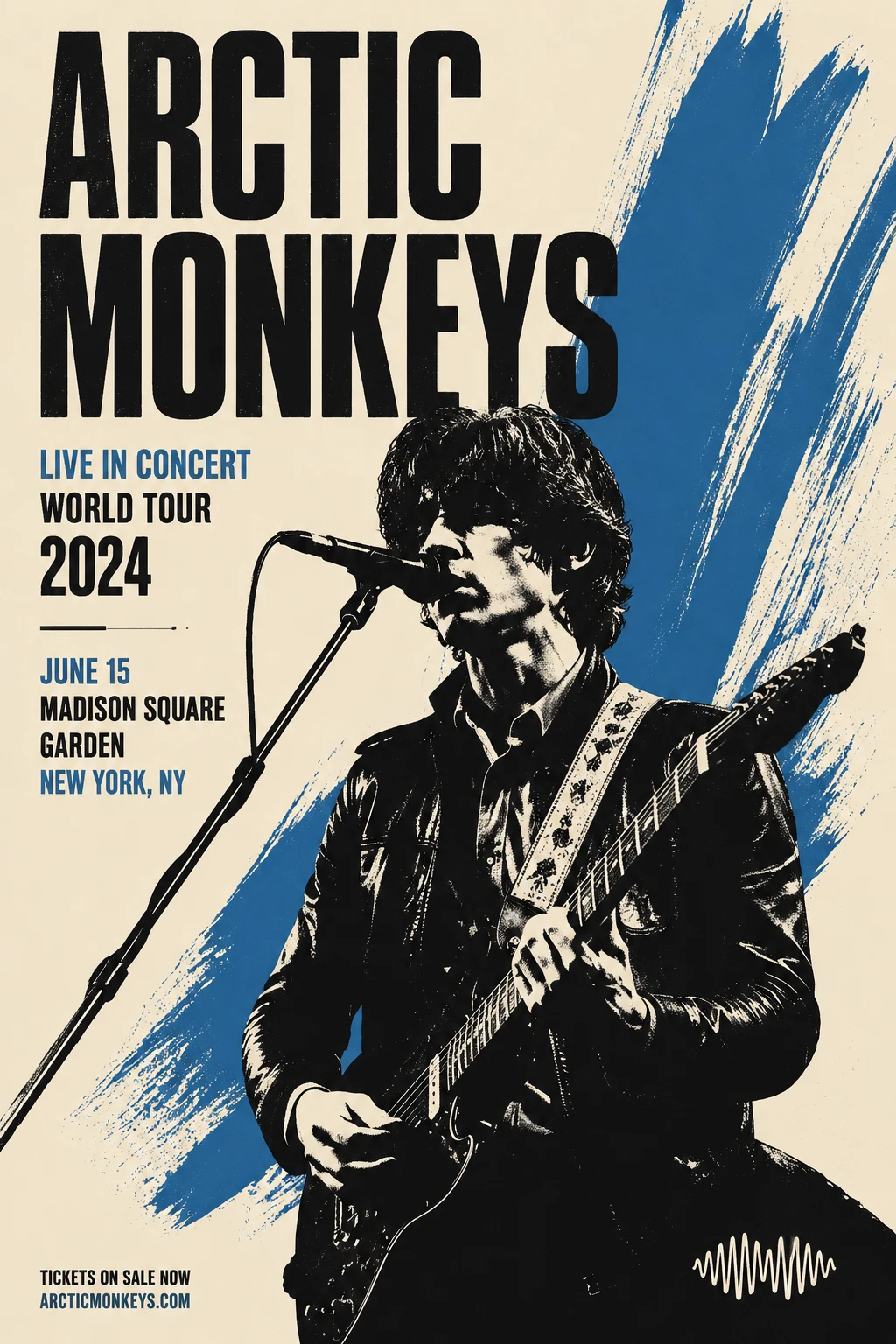
Template 4: Poster Design
a [subject] poster, [visual style], [composition: vertical/horizontal/centered], [color scheme], [text space location], [mood/energy], graphic design poster artExample: "a summer music festival poster, bold geometric shapes, vertical composition, neon pink and electric blue, top third reserved for event title, energetic and vibrant, graphic design poster art"
Template 5: Concept Art
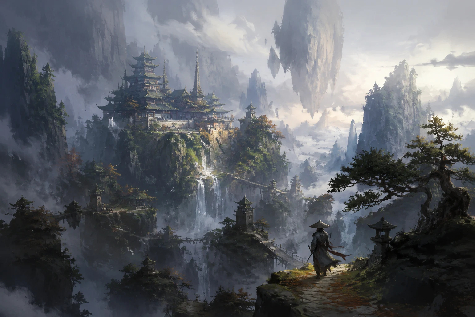
concept art of [subject/environment], [art style: painterly/digital/sketch], [perspective], [lighting mood], [color palette], [level of detail], professional concept artExample: "concept art of a futuristic desert outpost, digital matte painting, wide establishing shot, harsh midday sun with deep shadows, desaturated ochre and steel blue, highly detailed architecture, professional concept art"
Template 6: Social Media Asset
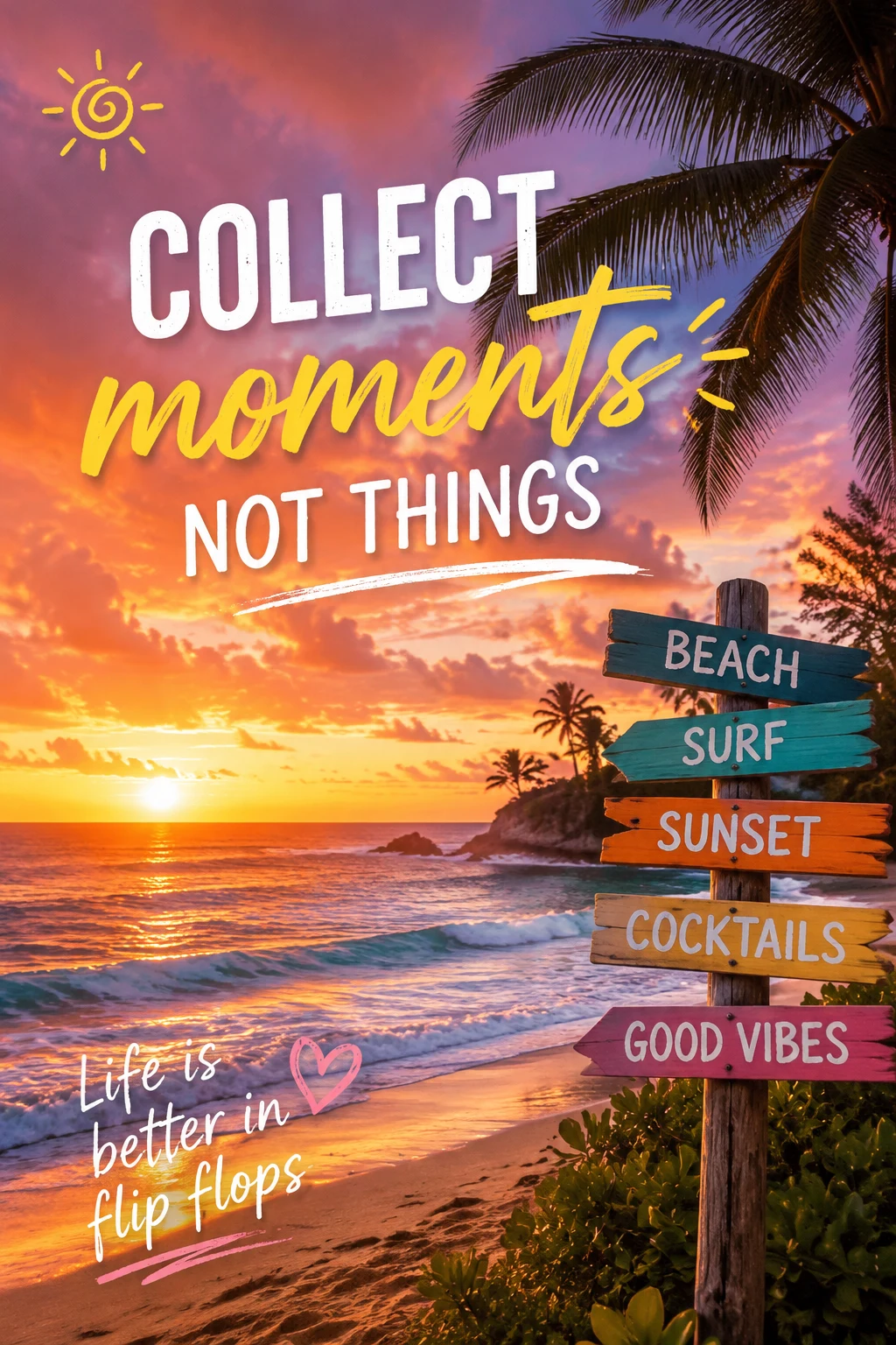
a [subject] for social media, [platform: Instagram/TikTok/Pinterest], [visual style], [aspect ratio consideration], vibrant colors, eye-catching composition, [target mood]Example: "a flat-lay breakfast scene for Instagram, bright and airy photography, square 1:1 composition, pastel tones with pops of coral, cheerful and appetizing, food photography"
Model-Specific Tips
Different AI models respond to prompts differently:
GoAIGen (gpt-image-2)
- Strengths: Precise instruction-following, complex compositions, photorealistic rendering
- Optimization: Front-load subject + style in first 20 words, be explicit about lighting
- Best for: Product photography, editorial imagery, detailed scenes
Stable Diffusion
- Strengths: Artistic styles, anime/illustration, supports negative prompts
- Optimization: Use negative prompts aggressively (
blurry, low quality, distorted), weight keywords with()or[] - Best for: Character art, stylized illustrations, creative experimentation
Midjourney
- Strengths: Aesthetic cohesion, painterly quality, "vibes"
- Optimization: Shorter prompts work better (30-50 words), use
--parameters for aspect ratio/style - Best for: Concept art, mood boards, artistic imagery
Gemini Image (via GoAIGen)
- Strengths: Natural language understanding, context-aware composition
- Optimization: Write prompts like natural sentences, less keyword-stuffing
- Best for: Quick iterations, conversational prompt refinement
Common Mistakes & Quick Fixes
Mistake 1: Keyword Soup
❌ "ultra detailed 8K photorealistic hyper mega stunning breathtaking masterpiece"
✅ Pick 1-2 quality terms max: "photorealistic, highly detailed"
Mistake 2: Vague Subjects
❌ "a cool character"
✅ "a cyberpunk street samurai, neon-lit alley, leather jacket with glowing circuit patterns"
Mistake 3: Ignoring Aspect Ratio
❌ Using "wide cinematic landscape" with a 4:5 portrait ratio
✅ Match composition language to your chosen ratio
Mistake 4: Over-Specifying Minor Details
❌ "exactly 3 birds flying in the top-left quadrant at 45-degree angles"
✅ "a few birds in the distance, adding scale"
Mistake 5: Copying Prompts Without Context
Prompts optimized for one model/task often fail when transplanted. Adapt the structure, not the exact wording.
Diagnostic Checklist: When Results Disappoint
Run through this 5-step audit:
1. Subject clarity: Can I sketch this from my description alone? 2. Style conflicts: Am I asking for incompatible aesthetics? 3. Lighting specificity: Did I define light quality and direction? 4. Composition direction: Does the model know where to place things? 5. Prompt length: Am I over 150 words? (Trim bottom-up: mood → tech terms → lighting details → composition → style → subject)
If results are still off after fixing these, try:
- Negative prompt (if supported):
blurry, distorted, low quality, bad anatomy - Reference image (if supported): Upload a visual example
- Seed locking (if supported): Keep good results reproducible
- Model switch: Some subjects work better on specific models
Conclusion
Mastering AI image prompts isn't about memorizing magic words—it's about understanding the 8 dimensions that give you control:
Core: 1. Subject Content (what to draw) 2. Artistic Style (how it looks)
Strong: 3. Composition & Camera (spatial arrangement) 4. Lighting & Color (mood and energy)
Supporting: 5. Atmosphere & Mood (emotional tone) 6. Technical Quality (polish level) 7. Medium & Context (output purpose)
Meta: 8. Conflict Detection (what to avoid)
The pros don't write perfect prompts on the first try—they iterate through dimensions, testing one layer at a time. Start with subject + style, then add composition, then lighting. Most improvements come from the first 50 words, not the last 100.
Ready to put this into practice? Head to GoAIGen and experiment with the templates above. Every dimension you master gives you more creative control and fewer wasted generations.
What to try next:
- Pick one template and generate 3 variations by changing only the style dimension
- Take a weak prompt from your history and rebuild it dimension-by-dimension
- Challenge yourself: describe your dream image using exactly 40 words across 4 dimensions
The best way to learn prompt engineering is by doing—not by reading. Now go create something.
*All example images in this guide were generated using GoAIGen with gpt-image-2. Create your own at goaigen.ai/generate.*